From the late 1980's to today, see how Rapture Ready has evolved into the World's Number One Rapture Website!
1989
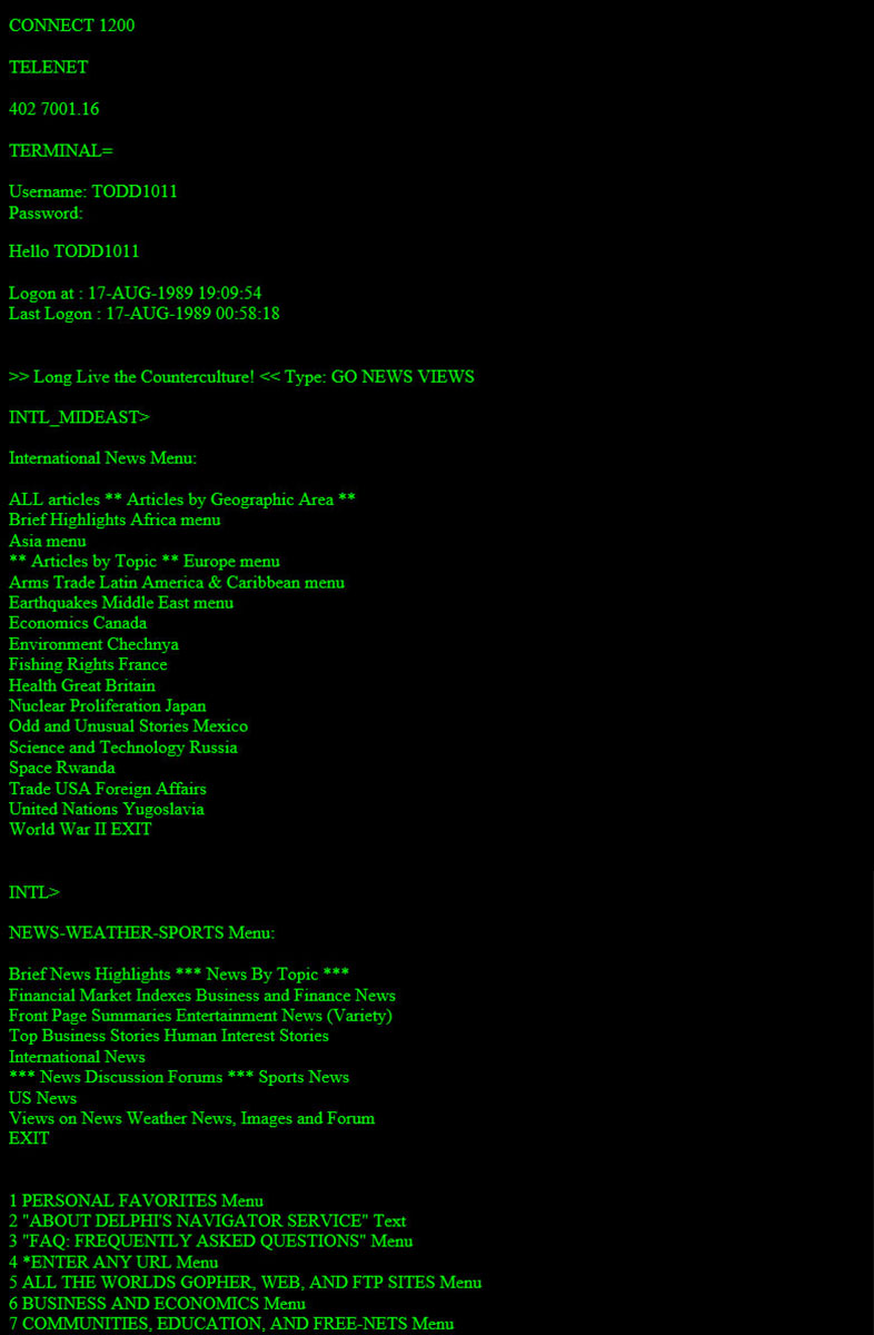
In the late 1980s, there were no websites as we know them today. Most people accessed the internet through text only displays. This site started with the Rapture Index. The weekly updates were posted in newsgroups like: alt.bible.prophecy or alt.christnet.second-coming.real-soon-now. Click on the picture to see what it looked like on an old monochrome "green screen" monitor.
1993
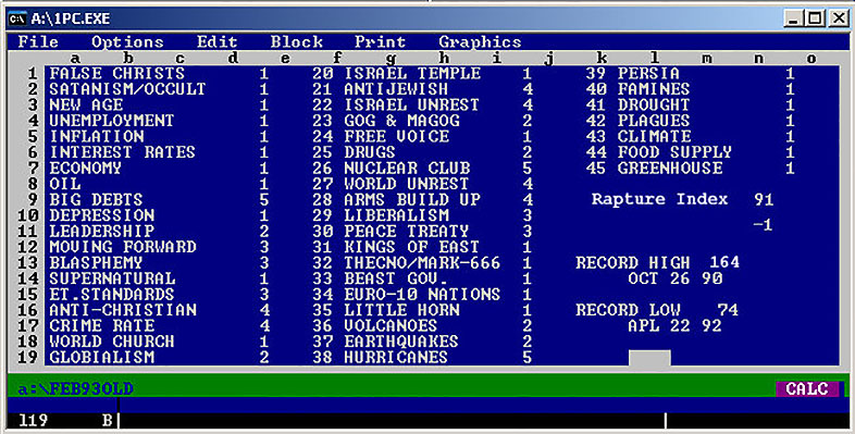
In the days before Excel spreadsheets, data for the Rapture Index was maintained by a DOS-based program called 1PC.exe. Notice the blue screen and lack of graphics. As this was more of a computer program than a website code, there was no cut and past function, so all the information had to be hand entered. This system was used until .html coding and the development of actual websites became more mainstream.
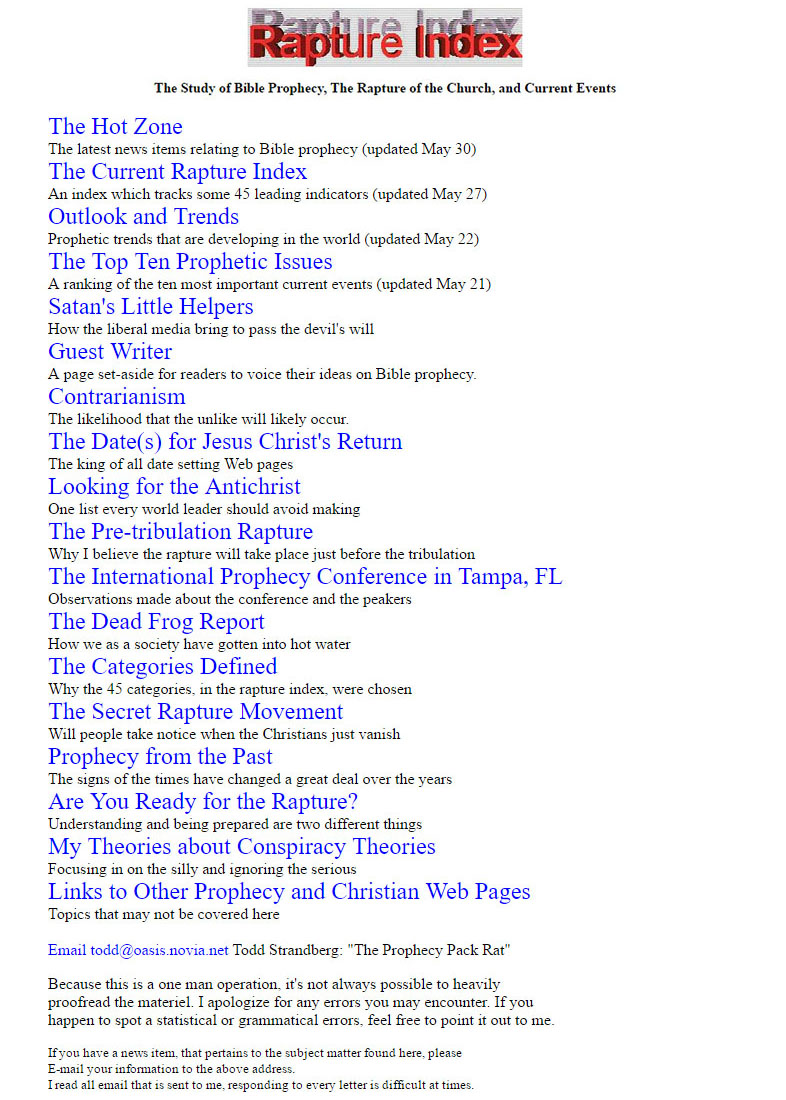
1995
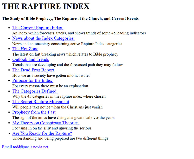
This was what the website looked like in 1995. This is the first web format and was hosted by Novia.net. At the time, Rapture Ready only had seven articles. Because most people could only access the internet at a 1200 baud rate, there was no room for graphics. Click on the picture to see what the site looked like at the time.
1996
This is Rapture Ready just one year later. The site's first graphic header stands as one of its ugliest. For the next decade, the site would at least double in size every year. It quickly became one of the most popular prophecy sites on the internet. Click the picture to see more.
1999
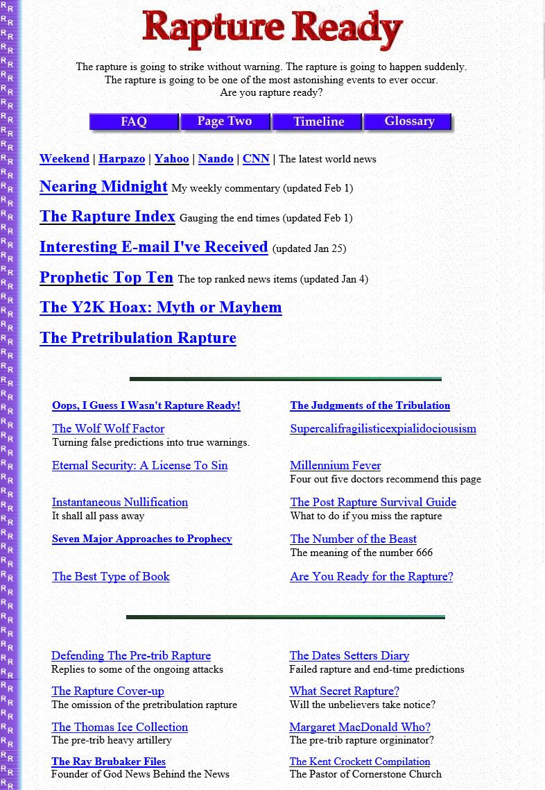
This is what Rapture Ready looked like in 1999. The name was changed to from Rapture Index to Rapture Ready when a visitor pointed out that the word, index, was a standard name for web files, and Rapture Ready would stand out from the crowd. Click on the picture to see what the site looked like then.
2001
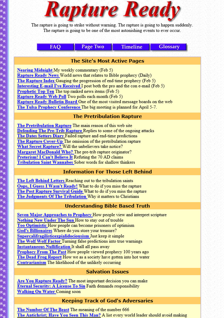
In 2001, a little more color began to show up on the website and we introduced the use of tables, or "boxes," to provide better organization and structure. Around this same time, the site began to draw the attention of major media outlets around the globe. Click on the picture to see this version.
2003
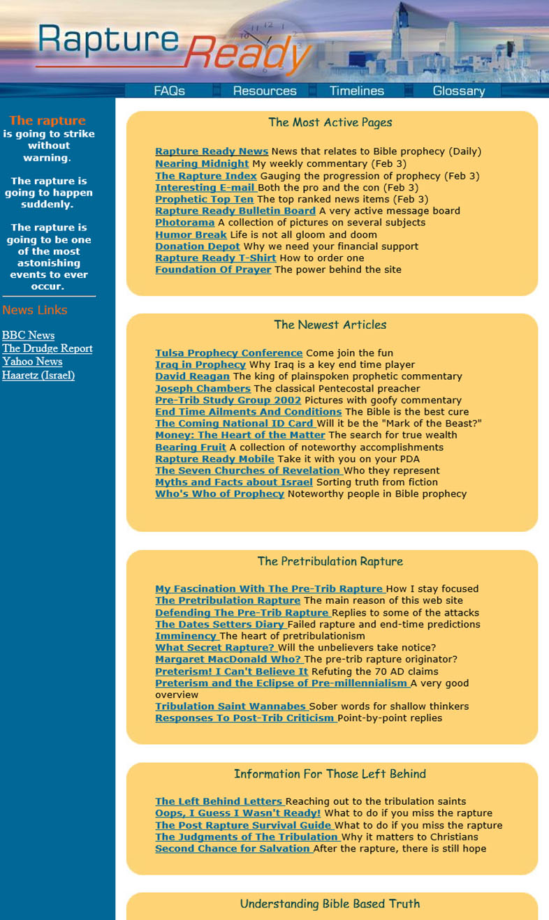
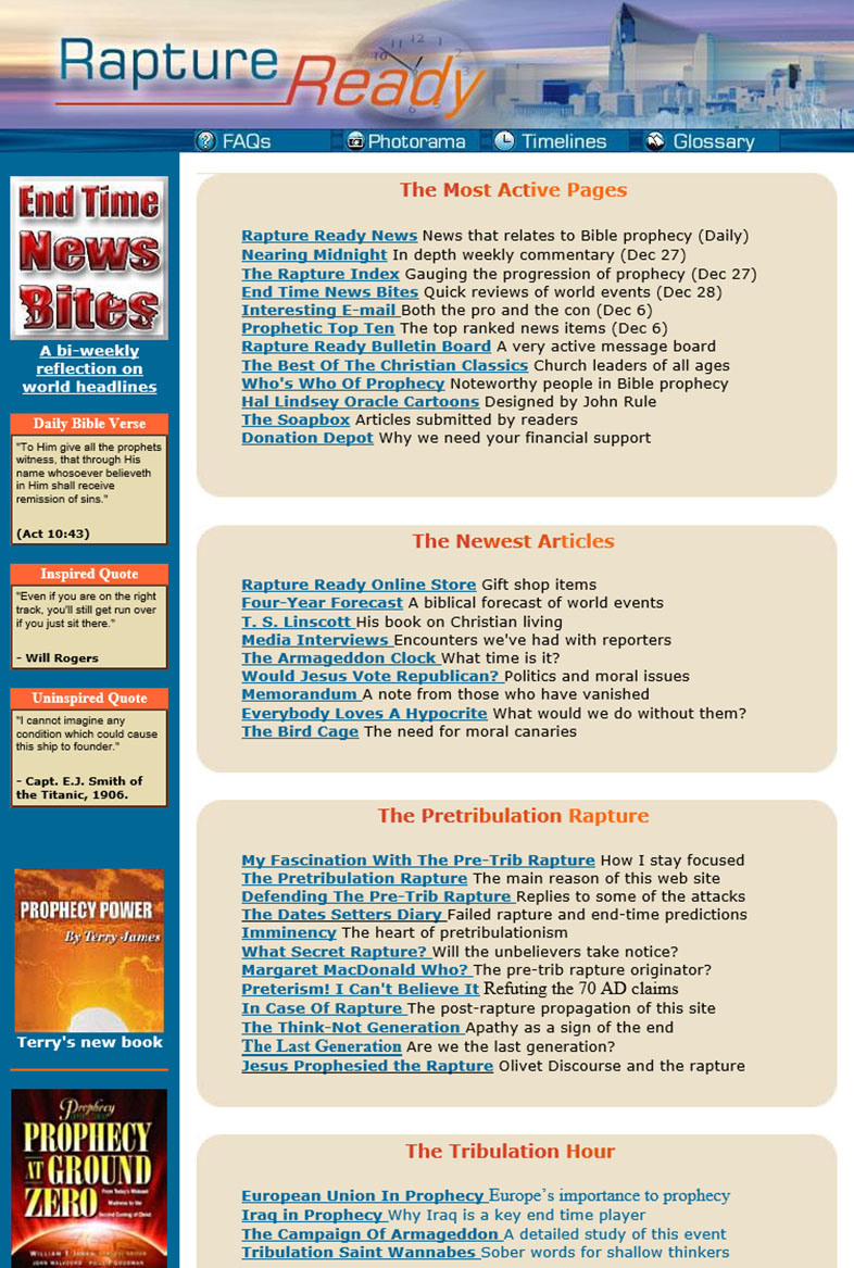
The use of graphics on websites has come a long way since 1996. We refer to this design as the, "Cincinnati Look" for Rapture Ready. The web designer who we hired to create a banner for RR used the skyline from Cincinnati. Several people who lived in that city contacted us and jokingly asked if Armageddon was going to begin in the Buckeye State. Click on the image to see more.
2005
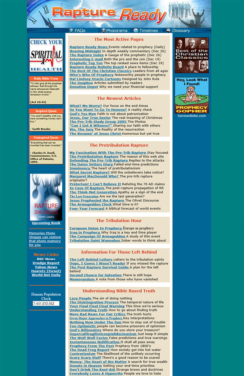
This is what the Rapture Ready website looked like in 2005. You can see that Rapture Ready is starting to look more professional and interesting to the eyes. By the end of 2005, there were over 20,000 files on the site. Click on the picture to see this revision.
2006
Just one year later, several alterations were made to the site. Along with a new logo and banner graphic, the entire website was moved to the center of the screen to allow for a more pleasant viewing experience as more and more people were switching to larger, flat screen monitors. We also began a project to remove the older interior pages with the purple RR stripe in the left margin. Click on the image to see more.
2010
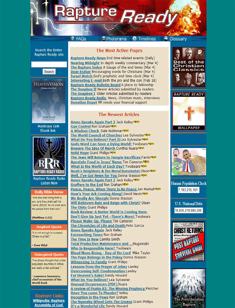
This design was known as the, "Nuclear Look" for Rapture Ready. One of the most noticeable changes from 2006 is addition of a Search Box, allowing visitors to easily search our vast archive of rapture and end-time resources. A page of unique, downloadable wallpapers was also added to the site. Click on the picture to see this look.
2014
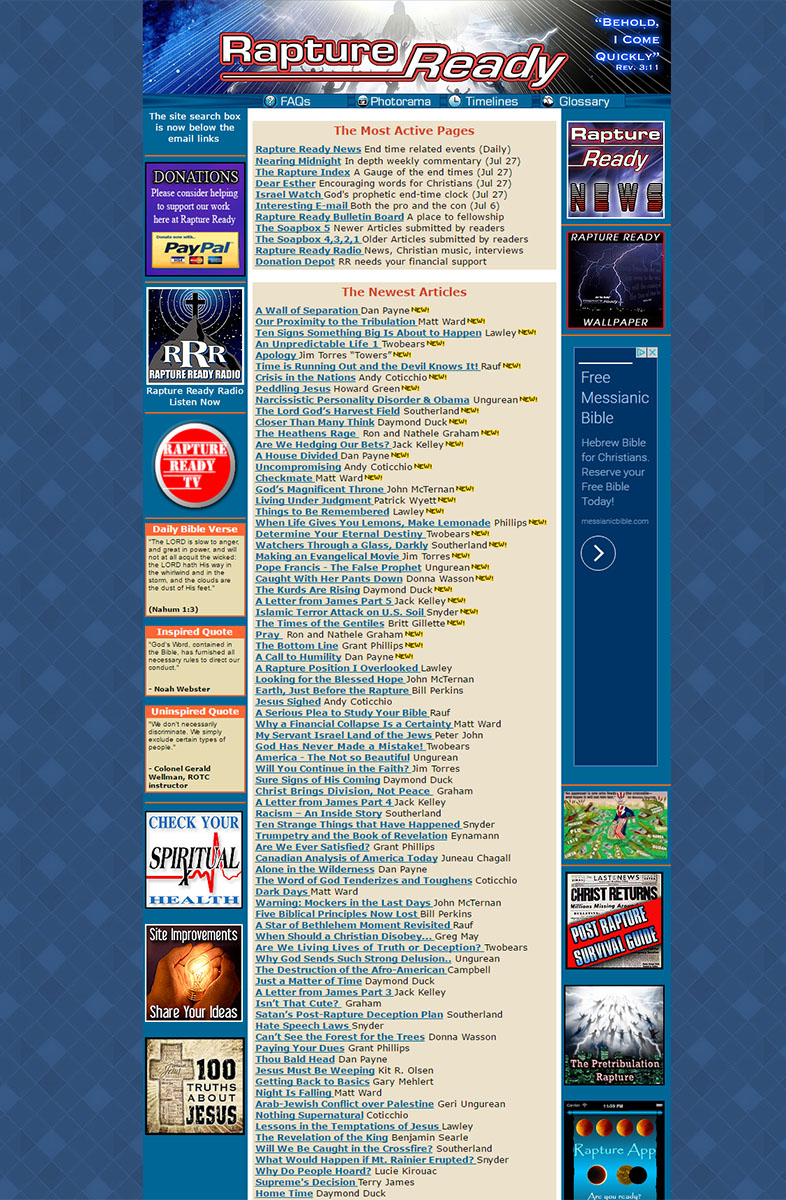
A new graphic banner and a dark blue background were the most noticeable changes in this revision. Our collection of articles continued to grow as authors around the globe submit their work to us for consideration. Our number of daily visitors climbed to more than 30,000. Click on the image to see more.
2017

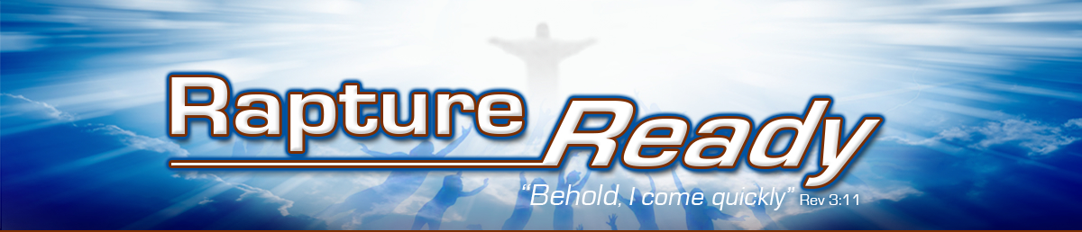
Our newest redesign has brought many improvements to the Rapture Ready Website. The site is now operating on a WordPress Platform. More than 16 million websites world-wide are run on WordPress. Our new design is now 100% Mobile Responsive. Almost 60% of all website traffic is from mobile devices. Mobile phones have a separate Google search algorithm allowing different results for individuals performing the same search via their phone. The new design also features a Translation Option that can instantly translate ANY PAGE into more than 40 different languages! Click on the image to return to the Home Page and explore all that our new look has to offer.